The Selected Element tab displays the properties for the currently selected object in the Contents pane, the properties vary depending on the type of object selected. An additional section beneath the properties panel is populated when a specific property is highlighted. This enables the full list of values to be viewed for any properties that are too large to fit on the main display. Some of the core properties are explained below.
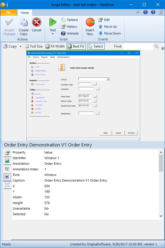
- Identifier – A unique identifier for that property on this screen, made up of the Role plus a unique number. For example the fifth text box on the screen would have an identifier of ‘Text 5’.
- Annotation – A plain English description of the property, according to the annotation rules within the option set being used. For example this could be the caption of a button or the label to the left of a text box. If this is a cell or row within a table it will be the name of the selected column followed by the column or columns which uniquely identify the row in brackets.
- Annotation Index – If more than one element has the same annotation, the annotation index is incremented to make each element unique.
- Role – The type of element, for example a radio button or text box.
Two additional right click options exist which may be used by your support contact if you are not getting the information that you expect. Some more advanced properties can be listed and all properties can be copied to the clipboard so that they can then be included in an email.