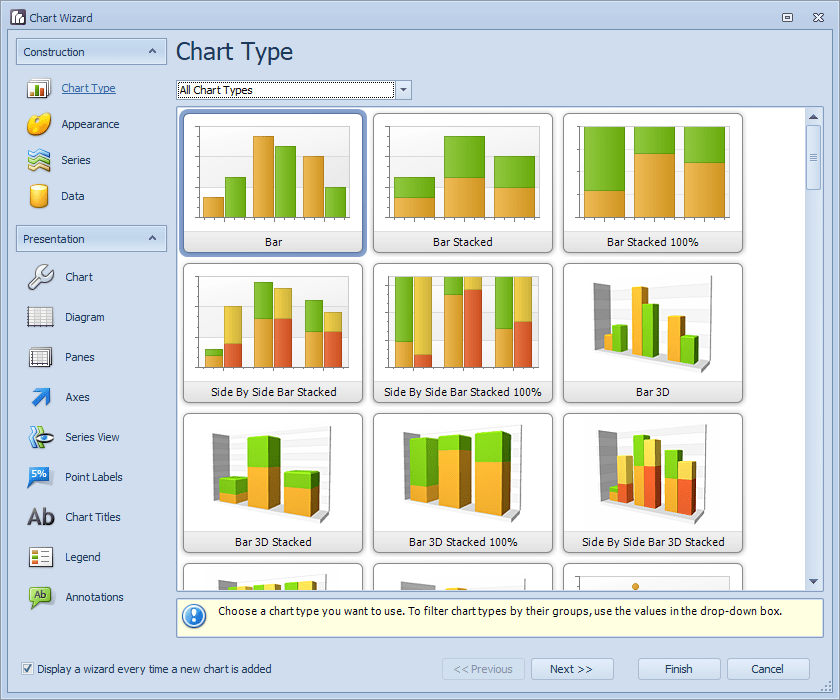
The Report Designer incorporates a very powerful and customisable chart wizard that allows adding 2D and 3D charts to the reports. There are almost 60 types of charts that can be created and each type has plenty of options grouped in 13 distinctive categories. You can navigate through the wizard by clicking on the different options or by using the Next and Previous buttons.
Chart Type: Choose the Type of chart (e.g. Bar, Pie etc.).
Appearance: Choose a Palette and Style to define the colours used in the Chart.
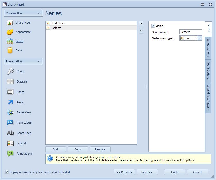
Series: Create series and change their general properties.
Data: Link the series with the actual data.
Chart: Customise the Chart properties.
Diagram: A diagram is the main area of a chart.
Panes: A pane is the area used to plot series and their associated axes.
Axes: Most charts use two axes: the axis of arguments (X-axis) and the axis of values (Y-axis). This allows customising the axes.
Series Views: Customise the view type options of a series.
Point Labels: Customise the point labels of a series.
Chart Titles: Add titles to a chart and customise their appearance.
Legend: Customise the legend appearance
Annotations: Create and customise annotations (text or image speech bubbles). These can be anchored to a chart, pane or series.
By dragging and dropping the Chart Wizard into the report, it will automatically start and will allow you to select the Chart Type.
On the Appearance screen choose a Palette and then a Style from the available options and then click Next. On the next screen, click on Series 1 and then change the Series Name to Test Cases. Then change Series 2 to Defects. Also, for the Defects series change the Series view type to Line and then click on Next.
On the Data screen we will select each series and bind it to the correct data using the Series Binding tab.
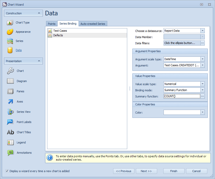
As you can see from the above screenshots both series use a date element as argument and this makes it possible for the series to be generated on the same X axis.
At this point, you can click on the Finish button and the Chart will be displayed and can also be previewed. Then you can go back to the Chart Wizard by selecting the Chart, clicking on its smart tag and selecting the Run Wizard option. Otherwise, click Next to move to the next page called Chart where you can leave all options as they are and just click Next again.
Once you have stepped through all of the sections, you will end up with a final product similar to the example below. For the Legend section, you have the ability to change the position of the Legend from Right Outside to Right. On the last section Annotations, this will depend if your chart will need. Save the report and preview it.