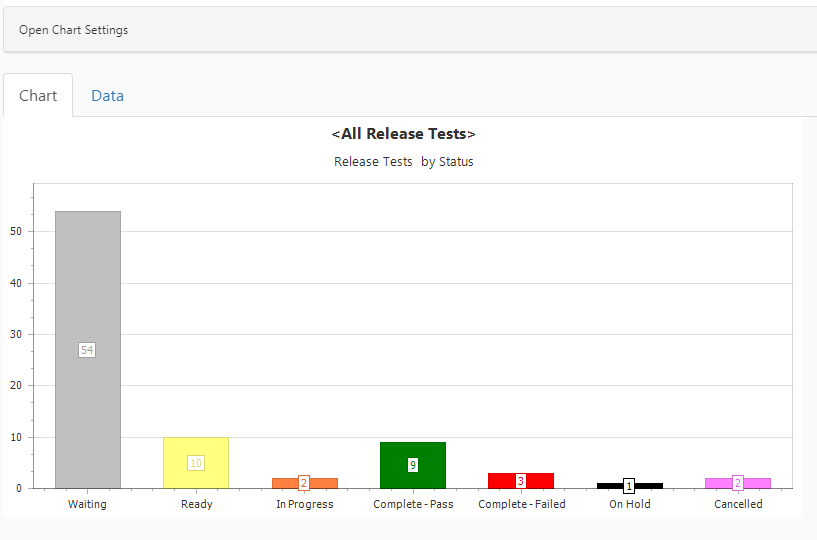
A very powerful feature of Qualify is the ability to create statistical views of the data. This data can be configured specifically to meet the needs of an individual user.
Click the New Chart option on the toolbar to create a chart from the grid of data currently in focus and add the chart as a view within the same layout. If grouping is being used in the focused grid, the properties being grouped by are automatically used on the chart axes and any filtering is also automatically applied. Also, if a selection list being used on the Chart has colouring applied in the Admin area, these colours are used on the Charts instead of the standard Chart palettes.
All property types with the exclusion of the ones below are supported in Charts:
- Duration
- Multi-value selects
- RTFs
- Any Entity Selection properties
- Any calculated columns or summaries that are not editable properties on the main entity
Once the Chart has been created, select the Save option from the Qualify toolbar to save the changes you have made. It will then appear in the left hand panel for the entity over which it is built and can be re-opened from there by clicking on it. If data for an entity is being viewed from its parent, for example when Defects are viewed from Testing Tasks, the Defects for the Tasks can be viewed in Chart form.